Let's Talk Macro Data Refinement!
Welcome back to this edition of macro dispatch!
I've had to do a lot of data cleaning for this piece. I hope you enjoy observing the highest-frequency data on the structure of flows of repo segments available to the public!
Also, the visuals are extra nice!
Let's get into the article:
If you think about it, the repo market is the MDR division of macro markets.
There are some scary numbers people on Twitter like to trough out via the net liquidity indicators, and they're very opaque (fancy word economist uses to say its BlackBox; we don't no exactly how things work)
When learning about it, it's not an issue of if but of how many times you will experience cognitive overload.
I remember the first time I read the description of the triparty repo in a paper by M. Singh (2015).
U.S. Triparty Repo Market: The Fed's Overnight Reverse Repo Facility (ON RRP) and the Term Repo Facility (TRF).
My head was spinning.
The concept is simple to think about now: It is a middleman repo, a buyer, a seller, and someone in the middle takes care of the collateral.
But then, I needed to understand how that puzzle piece fits into the whole, what the other actors are, and how it fits in the aggreagate...
It took a long time, and I'm still learning, as there is new data and less of a shadow in repo markets. Here, I try sharing what I learn by cutting the data up into slick visuals.
Visualizing that puzzle has always helped me, and I excel at it.
Having data helps a lot; it's more clear where to focus and what names are more important.
So this week, while reading a note from R. Jay, a senior economist at the Federal Reserve Board, and chatting with him on Twitter, it came to me that it was time to visualize a dataset on the backlog of my macro data refinement queue!
THE PRIMARY DEALER STATISTICS WEEKLY DATA
I've used it before to calculate the primary dealers' net positions to determine whether dealers are net long or short bonds:
You can access it here it updates every week with the latest data. if you want an email to say when its updated, leave a comment: https://www.macrodispatch.com/stir/.
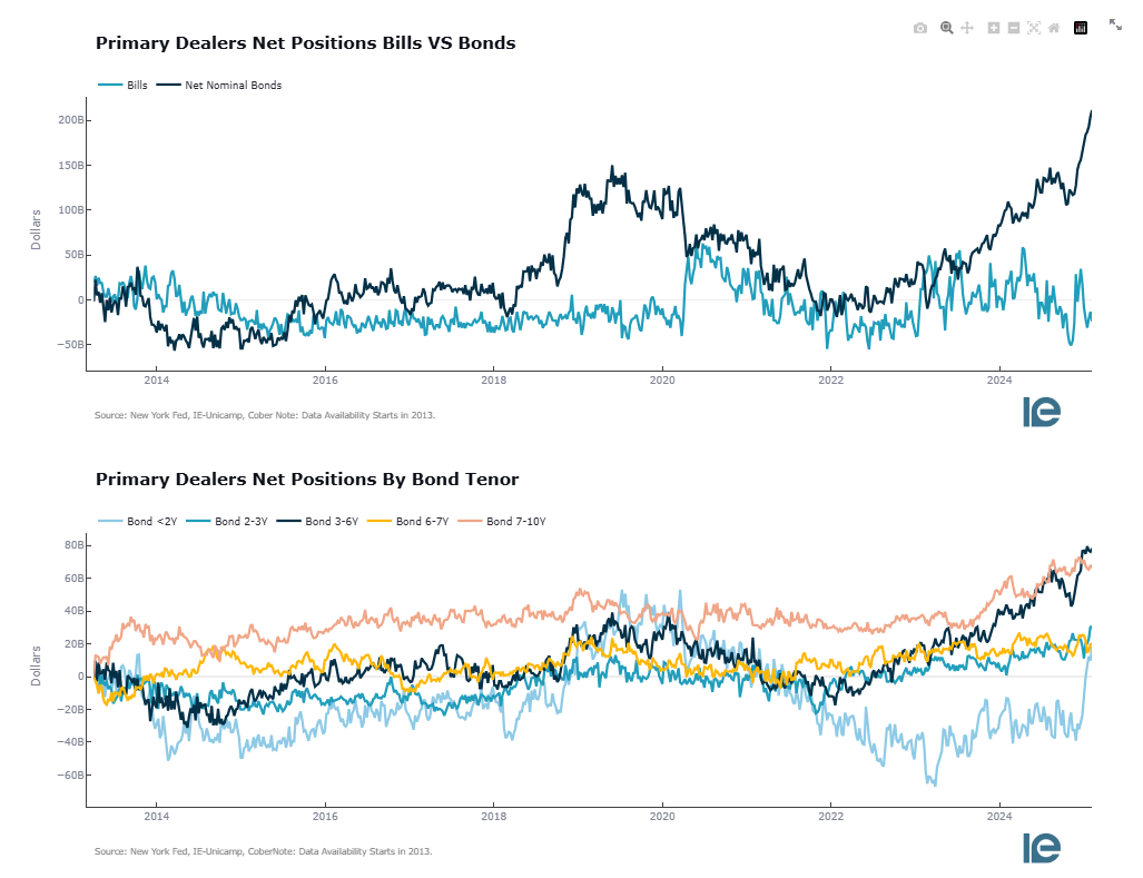
This indicator is frequently cited as indicating how lobsided the supply and demand dynamics in the collateral market are.
If you think about it, the residuals of flows also grow as debt grows.
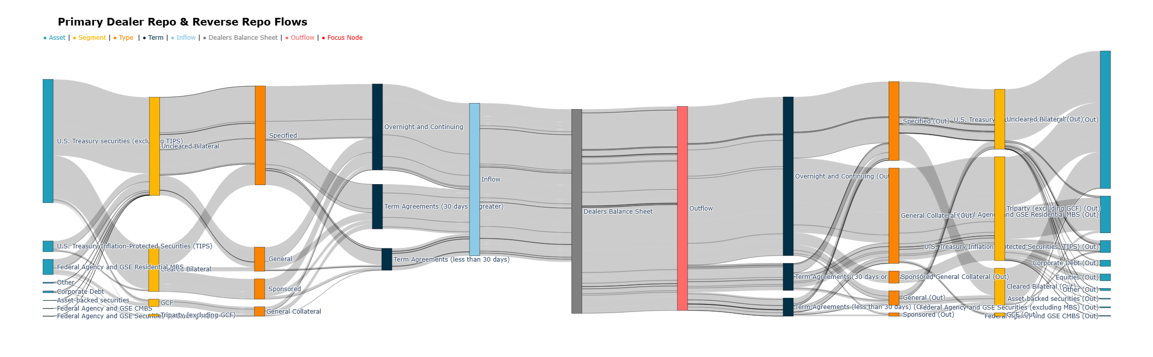
That said, we are cleaning and visualizing another segment of the repo market, this specific part tells us about what transactions are being made and is also the only high-frequency indicator on data about the infamous NCCBR (non-centrally cleared bilateral market).
And it captures a couple of different items:
In which segment: GCF, Triparty, General Collatall, Specified Collateral, Sponsored General, Sponsored
What assets are being used: MBS, Treasury securities, Credit, Equity, and others
the type of type: General Collateral, Specified Collateral, Sponsored Specified, Sponsored General,
The term: Overnight, More then 30 days, less then 30 days
The idea behind it is a tiny app that is coming soon.
However, I was excited to share the first iteration of this large network, and here are some snapshots.
Here, we start with the first information overload.
In this first part, the point is to show the structure of when someone is referring to the repo market, meaning to invoke the following monstrosity into the discussion or a subsegment of this:
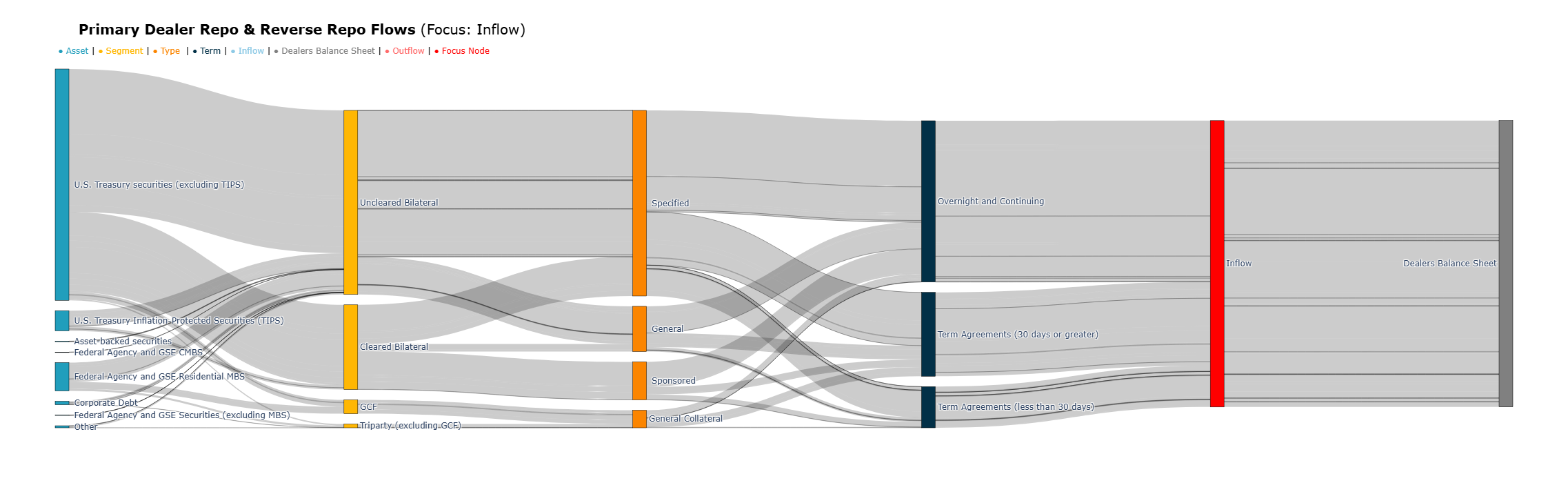
In the application, we will be able to filter down for examplee, focus only on the left part of the chart to zoom into inflows.
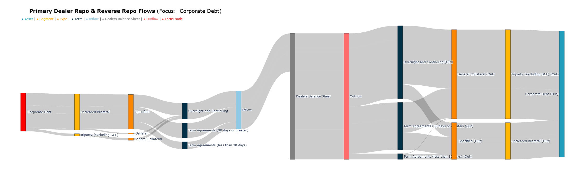
or zoom into the use of corporate debt as collateral and observe a certain behavior of this part of the repo:
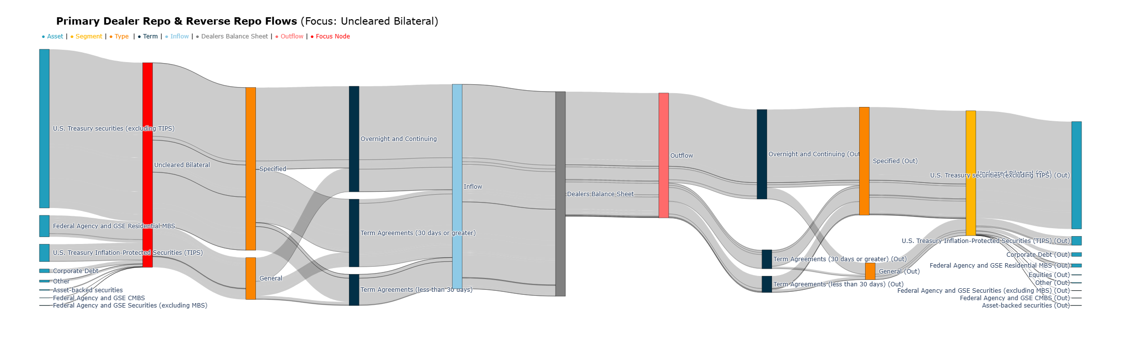
Or look at unforeseen bilateral flows at the focal point; we can assert the known behavior with higher granularity that there are higher inflows of collateral than outflows into the primary dealer's balance sheet.
Sponsored Repo has been growing rapidly. That said, here's a pretty interesting observation: the amount of sponsored repo and reverse repo activity on primary dealers' balance sheets is only about 373 billion reverse repos and 63 billion repos in cleared bilateral markets!
Which adds to 436 billion in volume!
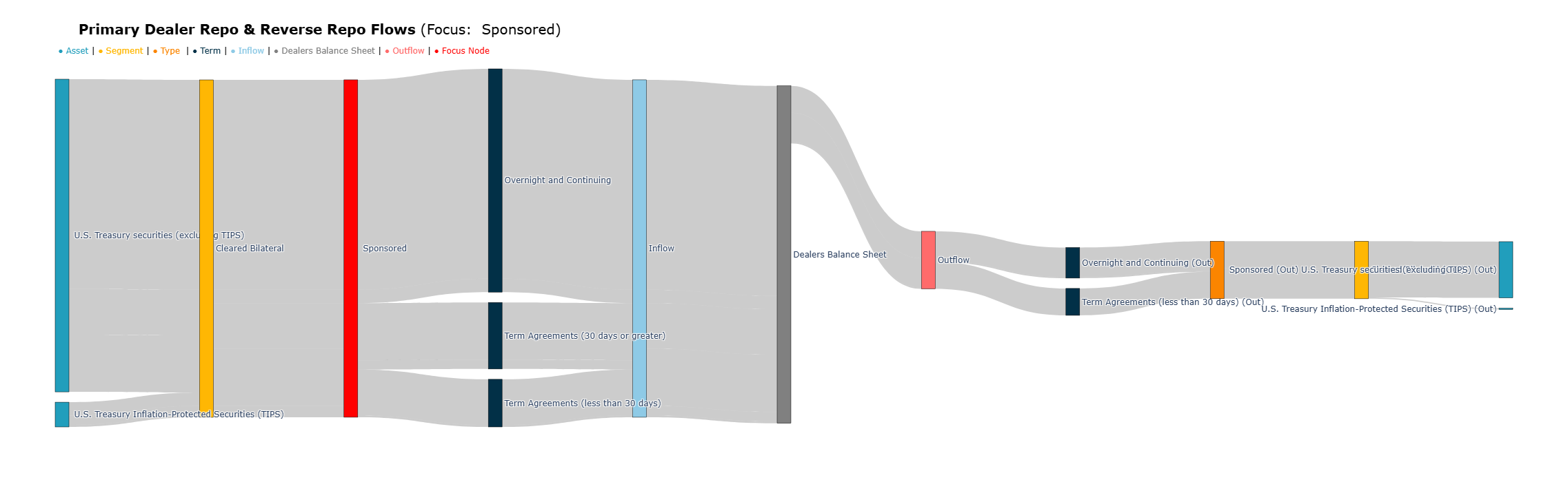
This is very interesting because, looking at the size of sponsored volumes in cleared bilateral markets, it is close to 1.33 trillion dollars.
This means primary dealer sponsors only account for close to 32% of the bilateral sponsored repo volumes, and this is mainly due to the inflow of securities.
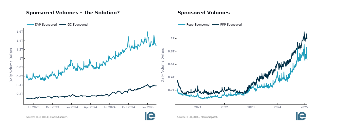
Therefore, non-primary dealers lend extra balance sheet space to HF and other financial institutions.
I hope you have enjoyed this macro data refinement and that visualizing the flows of repos can help you put the dynamics of repo markets in perspective.
If you like the content and want to play around with the app, please share it with a friend and give it a like—that's all I ask!
Obrigado,
Cober
Member discussion