The Dual Mandate Monitor #1 Prices
Welcome Back!
My name is cober, and this is Macrodispatch, where we explore Macroeconomics with a visual flare and aggregate the data points that matter!
And make them available to the public to monitor beyond just my discretionary opinion of the data; in this edition will start the Introduction
THE FED DUAL MANDATE MONITOR
Here's the current version of the report for those who want to take a peek!
Let's get into today's matter!
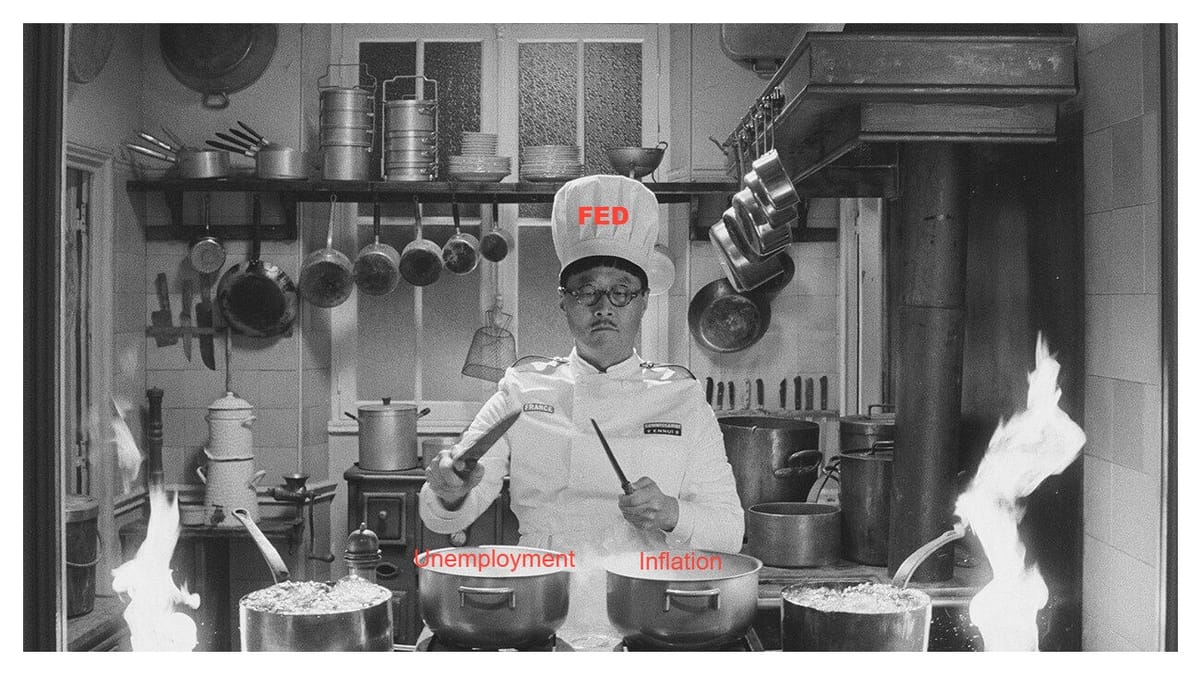
The FED Dual Mandate
The FED's modern statutory mandate, as outlined in the 1977 amendment to the Federal Reserve Act, is to promote maximum employment and stable prices. These two goals, often referred to as the dual mandate, are the cornerstones of macroeconomic policy.
These goals are commonly referred to as the dual mandate, so prices and employment are the variables that matter for this analysis!
Let's break this down from the perspective of prices!
Let's start with stable prices; how can this be measured?
PPI, CPI, PCE, Expectations, Others
PPI = Producer Price Index
CPI = Consumer Price Index
PCE = Personal Consumption Expenditures Price Index
Expectations = Survey, Market Implied, Models
Also, you should know the Headline vs Core vs Alternative categorization of inflation measures.
These exist to find one that fits your biased market narrative!
Economists and market Analysts also try to show the changes in a given index's less volatile components of inflation! Looking to understand the real trend of inflation!
Let's understand that effect!
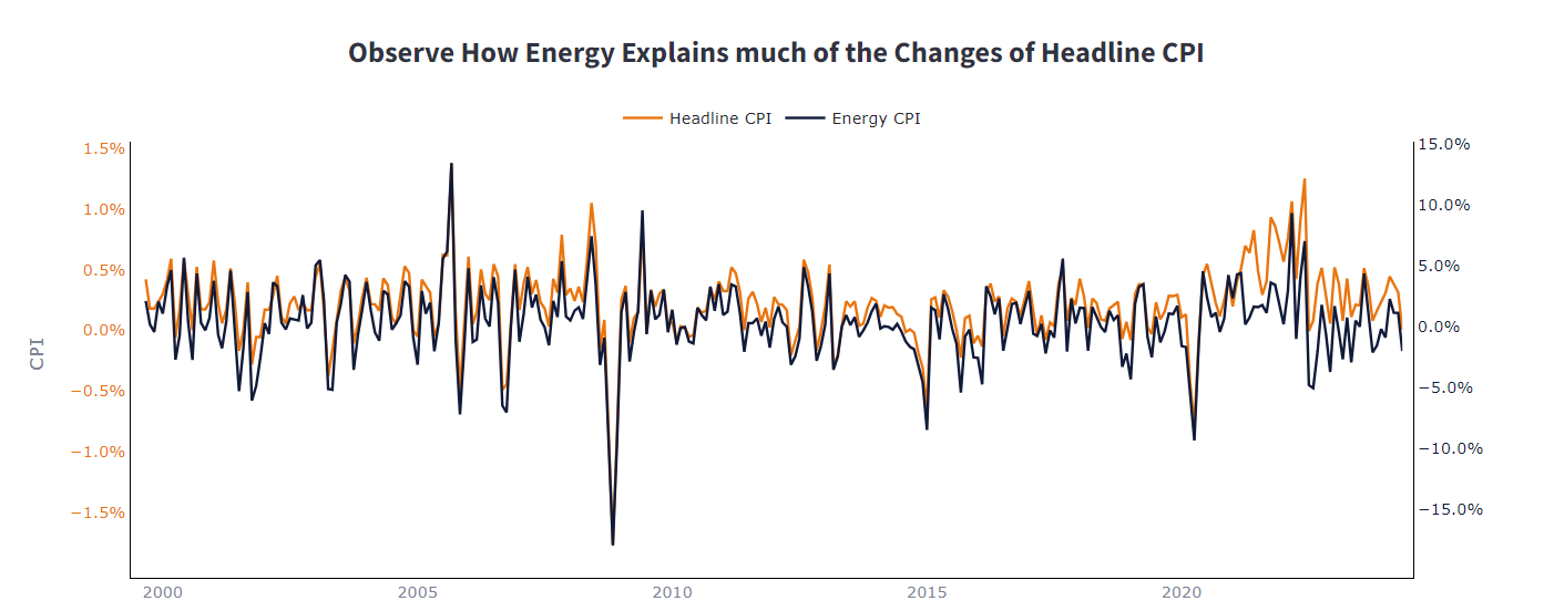
Now, the Consumer Price Index (CPI) is like an all-in-one tool for tracking inflation—it measures the average change over time in the prices paid by urban consumers for a market basket of consumer goods and services.
But here's the twist: energy prices can be as volatile as your favorite influencer's reputation. One month, they're up, and the next, they might plummet.
This volatility can give our overall CPI a serious case of mood swings, which doesn’t really help when you’re trying to suss out the underlying inflation trend—what economists lovingly call 'core inflation'.
So, let’s break it down with an example. Say the Headline CPI jumped by 2% in a particular month. If we find out that energy prices, which are part of this index, shot up by 10% the same month (and let’s say, for simplicity, they are 10% of the total CPI basket)
A simple back-of-the-envelope calculation could suggest that energy alone contributed about 1% (10% increase in energy prices * 10% weight in CPI = 1% overall CPI increase) to that headline figure.
This means that if the headline CPI was up by 2%, and energy kicked in a 1% increase, about half of that jump was just due to our flamboyant friend, Energy.
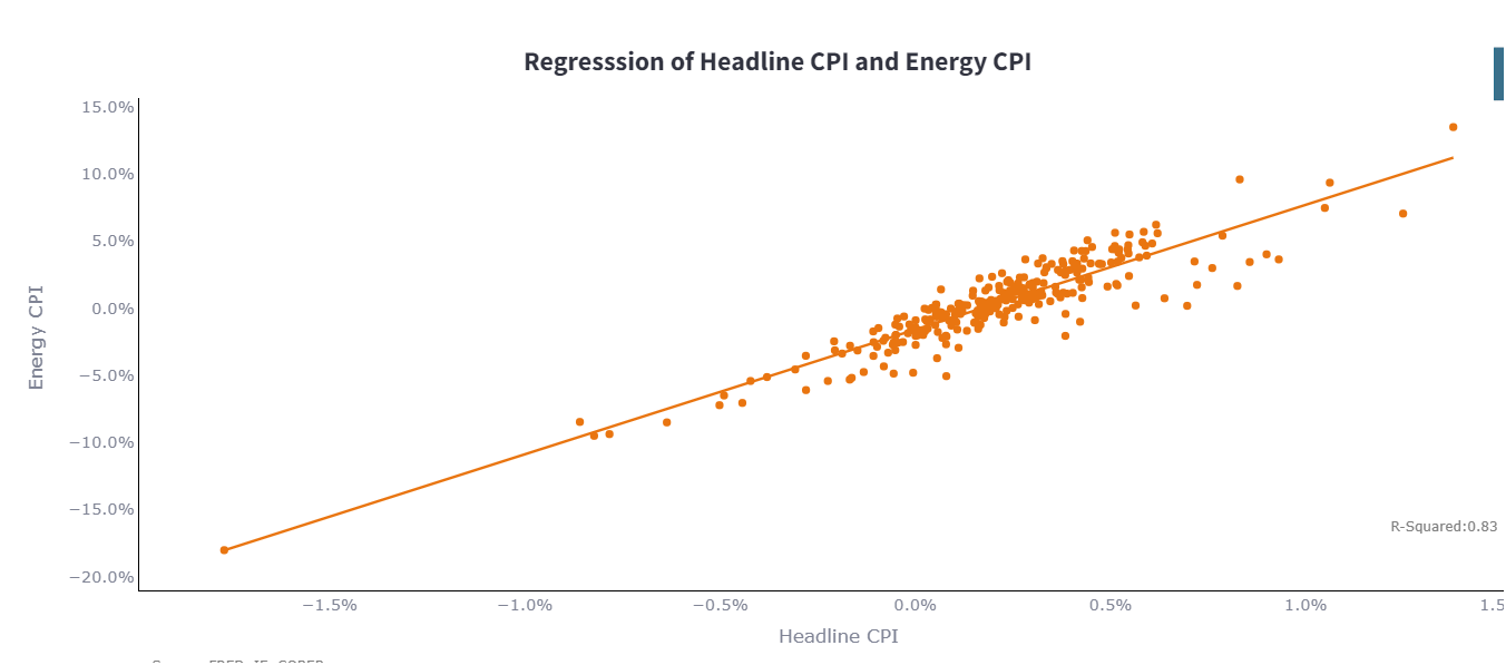
Running a Basic Regression over the past 25 Years of data or monthly changes in CPI, we can say that Energy Alone Can Explain Around 83% of the changes in CPI, meaning that other more stable components explain only 17%, but they are a significant part of the consumer's daily basket.
I worked in Energy Market Intelligence. Oil Prices and Products Have Wild mood swings due to Hurricane Watch, OPEC+ Decisions, Capital Availability for the US Shale, Pipeline Issues in Gas Markets in Europe or Russia, and 1001 other Factors!
So, what’s the analyst goal here? To peel away the layers of CPI and find that core inflation—the underlying trend that’s hidden beneath these volatile shifts.
The problem then becomes what the best measure of Core should be.
As we will see, there are multiple ways to Peel here. First, which price index better represents the CPI, PCE, or PPI trend?
As an analyst, you're trying to Gauge the Consensus, so all of them matter a bit. Therefore, we make them available! Especially if they match your main narrative
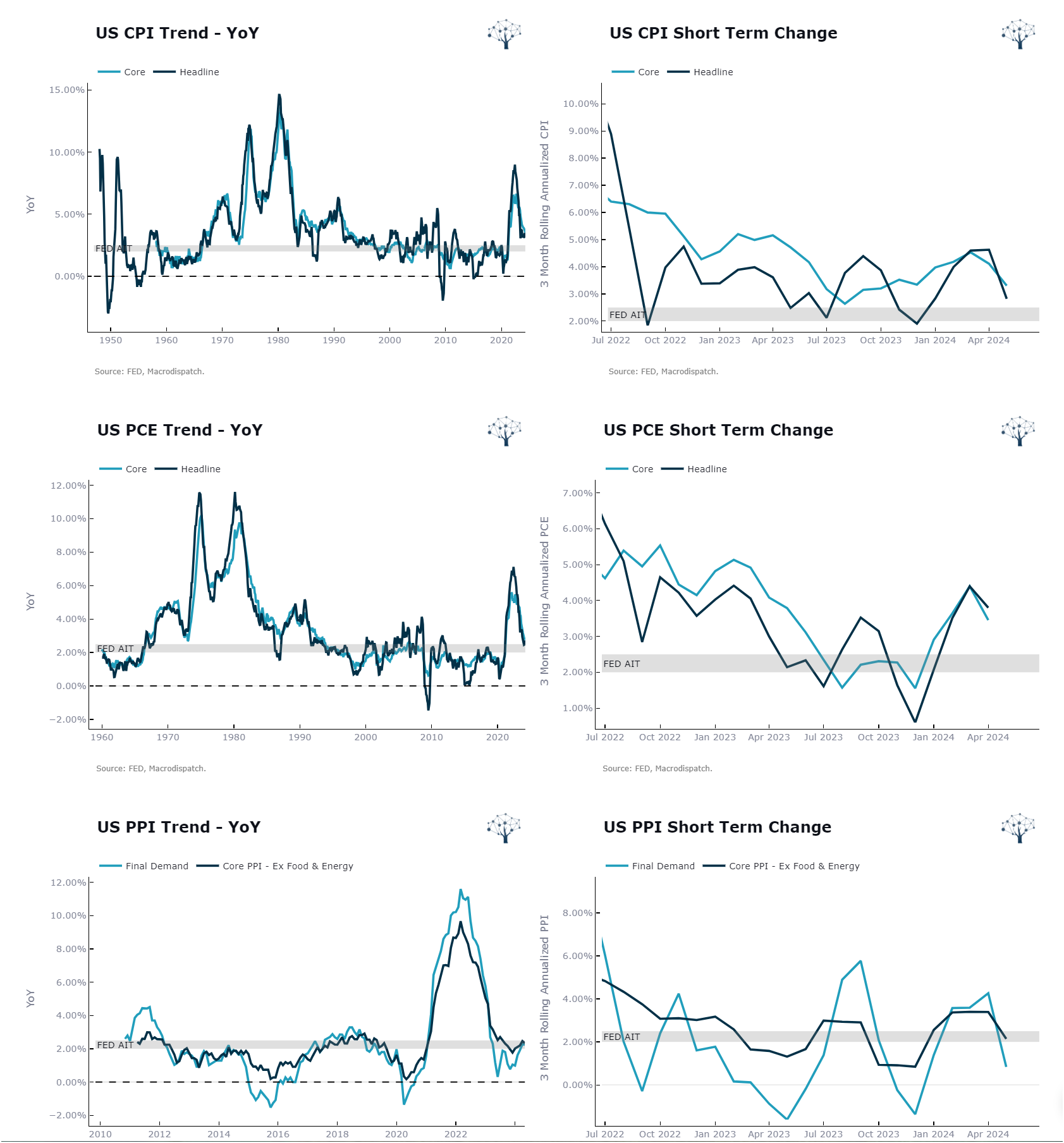
After Pealing Core and Headline, Analysts also like to peel the measures of core inflation by using the smallest subset of observations relative to the year-on-year measures.
The more popular versions are the Inflation Momentum 3M and 6M Annualized rates.
On the Left, We plot the Year on Year, and on the right, the three-month Annualized Core.
It is common to try and estimate the Underlying Inflation Trend by using Alternative Methodologies; here are a couple of them:
Inflation Expectations from Market Prices: Try to capture what money is betting on inflation. Are buyers backing out?
Consumer Expectations: What does the population think prices will be, and are they feeling the price increases?
Models: What does the math say about the chances of inflation exceeding 2.5%?
Alternative Core Measures: What does statistics have to offer as an estimate by moving the weight or cutting out certain sub-indexes from the measure?
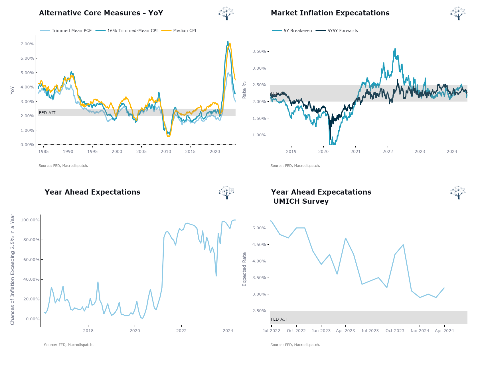
These metrics are ways economists, market intelligence analysts, discretionary macro traders, brokers, and others will have to look and choose from to form their opinions on the underlying inflation trend!
I'm not here to tell you what's right, but what possibilities exist when considering this question and an easy way to monitor them.
For today, That's All Folks!
If you read until here, thanks, you're awesome!
As always I will leave the interactive report that supports the visuals in the article at the end; there is a lot more still to cover from the Fed Dual Mandate Report,
See you next time, Tchau!
Member discussion