Data Updates #2 Graph Are Something
welcome Back to the latest edition of Macrodispatch in this week's edition we will go through
- The Biggest Knowledge Graphs in the World and the Information it Contains
- A Preview of a Housing Monitor Ive Built to get some color on this important US Market.
Hope You Enjoy Lets Dive in!
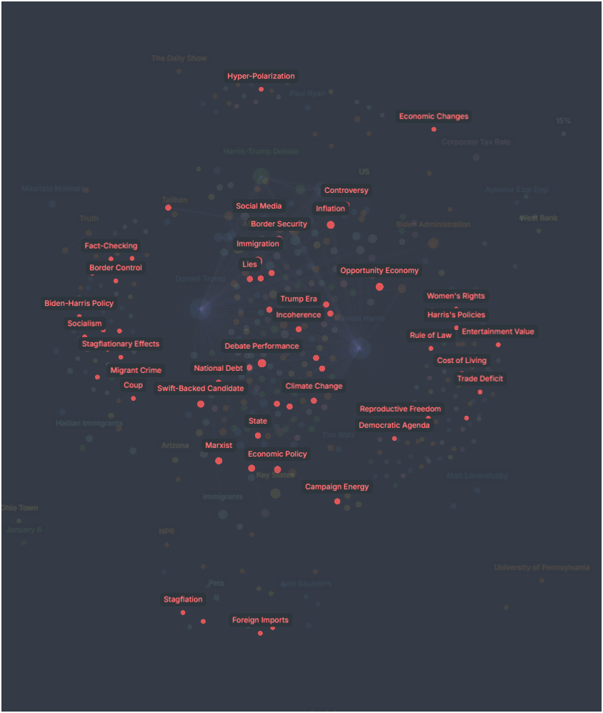
So, what is a Knowledge Graph 101:
A knowledge graph is a structured representation of information that connects data points through relationships, enabling machines to understand and reason about the relationships between entities.
Visualizing information like this opens up exciting possibilities. For instance, imagine debating a complex topic and seeing all the relevant connections right before you—no more guesswork or cluttered thoughts.
Over the past few weeks, I’ve enjoyed working with Robert from Ask News. He gave me access to the largest News Knowledge Graph on the internet. This has allowed me to visualize the economy through the lens of news articles, giving me a quick and insightful overview of big topics like:
- US Presidential Debates: What made the headlines?
- How the news shifts 48 hours following major economic events like the NFP release.


- And whats the debate Rates in the context of the Brazilian Central Bank, what can we learn!
This tool makes the big picture clearer, and complex topics are easily navigated. It’s been a great experience, and I can’t wait to explore more!
Also, check out AskNews. It's Pretty remarkable what they're doing over there!

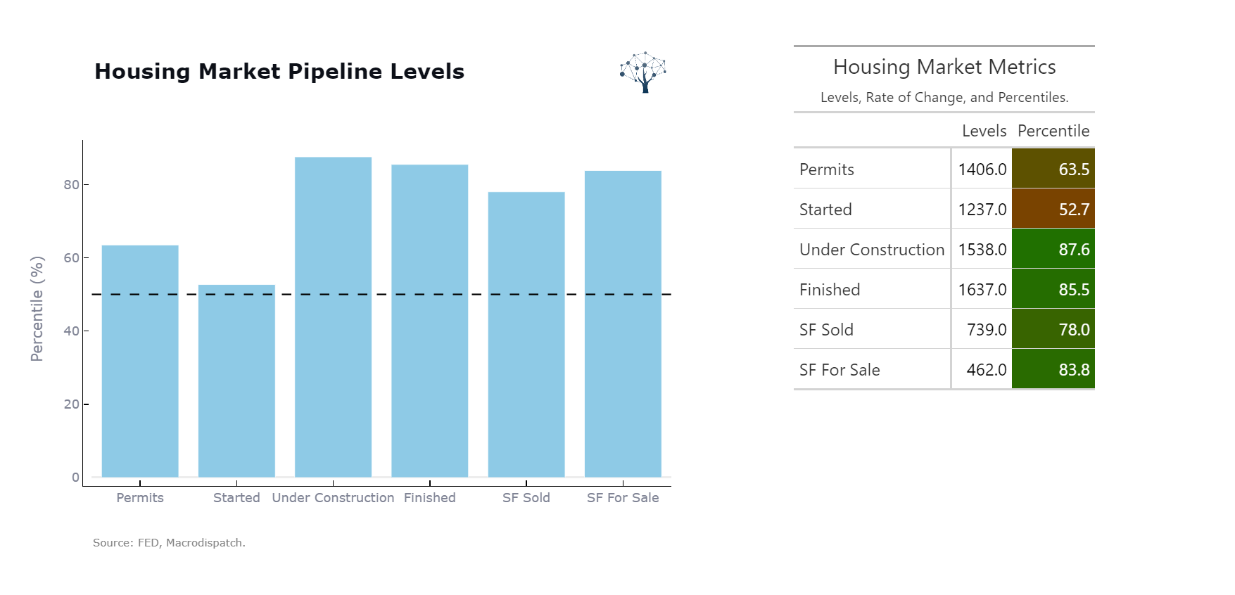
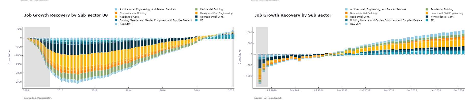
Now onto The Housing Market Monitor Beta Launch!
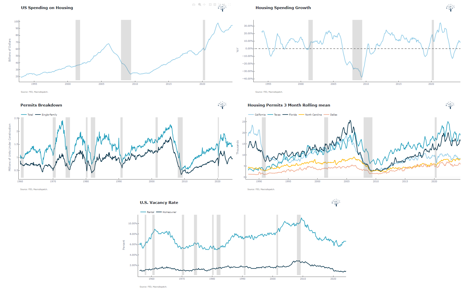
Here is a curated List of Charts 20+ to understand how the housing market Pipeline
We first concatenated to observe the overall activity of the housing market and its pipeline
How the Job Growth is Going relative to the 08 Crises
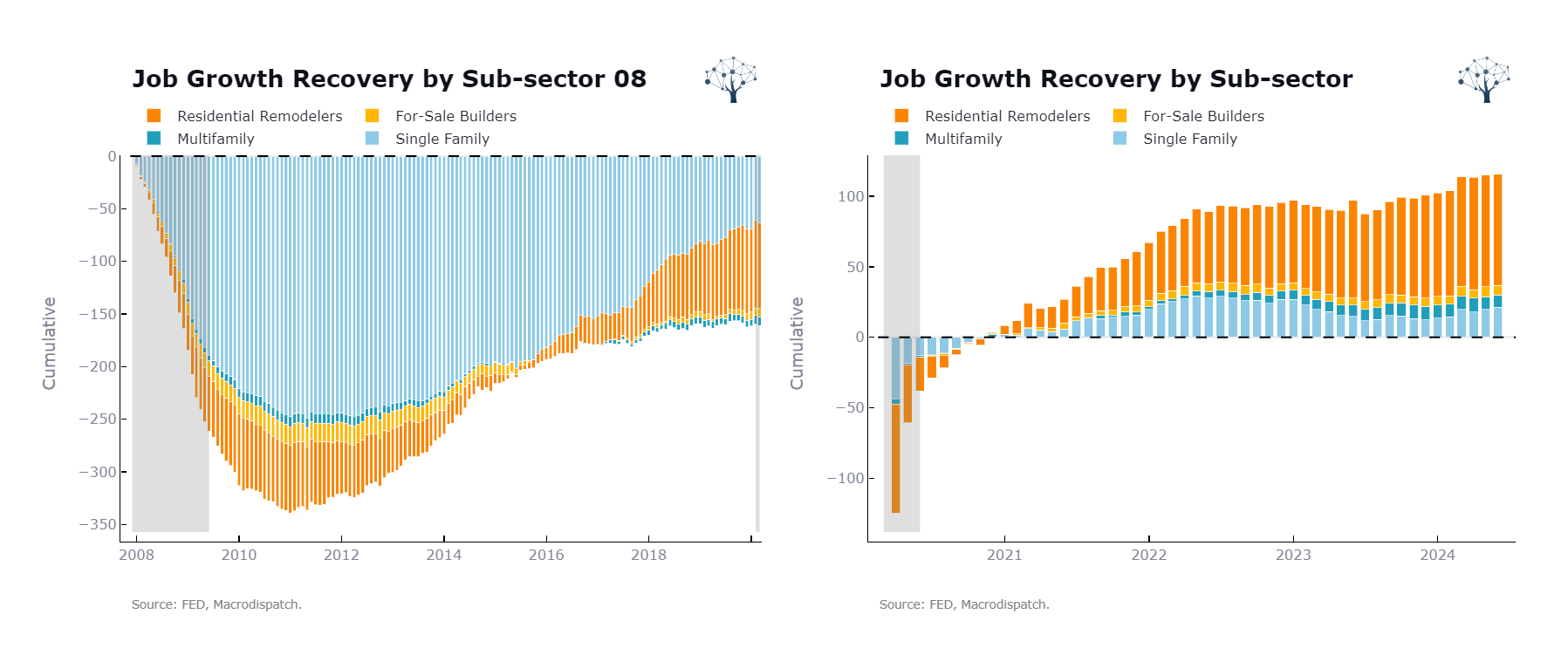
Or a more ample measure of Job growth recovery of Real Estate, including other related indexes.
The Spending On the Sector, Permits and Vacancy Rates
And More:
Go check it out at the link below!
If you read this until here you're awesome,
If this provided value to you give it a like and share it with your friends!
That's All I ask!
Best,
Obrigado
Cober
Member discussion